Saturday 19 July 2014

Fanshawe Designer Cupboard


 Fanshawe Designer Cupboard.

I received an interesting email from Jenny Cuyler, the Retail Promotions Coordinator/GM Buyer at Fanshawe College last week and she gave me an interesting proposition.

Original Cabinet
Jenny said, "We are starting a program in the Clothing Store called, Fanshawe Artisans. It will enable Fanshawe Alumni, Staff, Students, and Community members to sell their handmade items (on consignment) in the Clothing Store. They will be selecting limited items, and displaying the artisan's information with their item(s), so that customers can inquire further. We would like to set up the smaller items on a large shelving unit that we have in the Clothing Store, but would like to have it painted, first." So I said yes we will do it and here is the story of its transformation.

To start they delivered it right to the door which is very handy to have someone do. Jenny came by the same day and we discussed various options and I presented to her some ideas that I had.

Primed Cabinet

It was decided to give me some artistic licence so here we go. I started by preparing the piece. I moved the shelf hardware and the knobs. The knobs we discarded as I replaced them with ones of a larger size to go more into the scale of the unit.

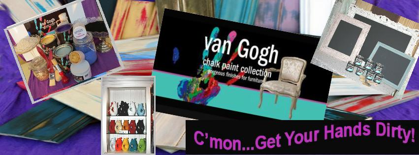
As there were some very prominent knots on the piece I sprayed those with a shellac based sealer. Normally with van Gogh chalk paint we do not sand or prime and other than sealing the knots this is what we did here. Choosing the correct colours was next. Red, White and Gray were the colours we choose. They specifically are van Gogh Fossil Paint "Lipstick", Stan Portleys signature series van Gogh Fossil Paint "Dragon's Gray" and van Gogh Fossil Paint "Chalk" which is an off-white. Also used was van Gogh Liquid Metals "True Love" which is a metallic red.

I painted the entire unit with our signature colour "Dragons Gray. This was for a number of reasons.

First, when I go to distress my thoughts would be if I distressed too hard there would still be gray showing through.

Second, because the next coat of paint would be the van Gogh Liquid Metals "True Love" which is a metallic red we do need a base coat of it.

Third, I planned on leaving the inside and the shelves the Dragon's Gray so it was just as easy to paint the whole thing.


Side view
Front View
 I then paint the inside back and the outside of the cabinet including 2 of the drawers the van Gogh Liquid Metals "True Love", metallic red.

What a wonderful colour! Bright and warm. Look at the shimmer.

 I also did our van Gogh Tye Dye technique to give a flair to the middle drawer and the new knobs on the upper and lower
drawers.


Finished Front


 The knobs on the middle drawer where done in van Gogh Liquid Metals, "True Love" metallic red and van Gogh Liquid Metals, "To The Bride" which is a metallic white.

The "Tye Dye" technique is probably the messiest of an technique I do. For this
drawer front I used a plastic drop sheet and made a curb around the top of my work table with the drop sheet draped over the curb.

The "Tye Dye" effect is using a special acrylic medium from the van Gogh Paintology Collection.

Finished LHS
 We add this to the chalk paint and the metallic paint and then vary the amount of water we mix in to vary the specific gravity of the paint or "thickness" of the paint.

Now we take the various paints and randomly pour, drizzle, throw etc. them over our work piece.

We then picked up the drawer, and moved it around. In doing so we see the different colours of paint move across the surface of the drawer front at different speeds.

The "thicker" paint running slower than the "thinner" paint. When we have the coverage and look that we want we set the drawer down so that the drawer front is horizontal and parallel to the table. It then takes over night to dry and up to 36 hours to cure to where we can apply our wax finish to the surface.

There are two more things we had to do and that is; distress the outside of the cabinet to reveal some of the beautiful, van Gogh Liquid Metals, "True Love", metallic red. Knobs were installed and then the final thing before waxing was putting the graphics on the side. I have to thank my friend Joanne Mudd of Muddarittaville fame for doing such a great job on the stencils for the project. Now I have to wax but that can wait a few days. Next project is an art deco cabinet we picked up recently. Stay tuned for more.


Friday 28 March 2014

Tye Dye for Furniture

Five samples done. They have been paired to represent time and the change over time of the design. Top sample is 24 hours after application. The bottom  example of each sample is 2 hours after application
Tye Dye for furniture who'd a thunk it!! Back when we were younger we would take fabric dye and tie-dye our t-shirts. The basic principle behind it is to produce an organic pattern by tieing knots in the material thereby limiting the amount of dye that would go into the t-shirt at different areas.

Tye Dye for furniture is and can be quite funky looking but also could be quite elegant. In the samples above we have used very bold colours. However this need not be the end result. The following examples show what can be done with a less bold palette of beige, tan, brown and black.

Drawer and samples done
Here we see the face of a drawer that we did in the colours above (vGCP Cashmere, vGCP Serenity, vGCP Balsamic and vGCP Revenge. I added an additional two, one was mascara and the other was a blend vGCP Balsamic and vGCP Cashmere. It created an additional tone between the Cashmere and the Serenity.
In preparation to do a Tye Dye job I start by picking the colours that are most appropriate for what I am doing. I try and pick out one main colour which is the same as the body of the piece being painted and then a complimentary colour or colours that will give the piece a bit of sophistication. Though my choice that I made above now looks frightfully like camouflage but we can work with it. I then take a number of small containers (I use 1oz containers that I get from U-Line and they have lids that I can close and save any of the mix I have left for another job. I am not sure how long it lasts but I have some that I mixed over a week ago that are still good.
Initial Setup for Application

Into each of the containers I will put an even amount of the Tye Dye Medium to start. I will then put a different amount of water into each of the containers. We then put a different colour in each container and stir to emulsify the liquid. What this does is it changes the viscosity or the informal notion of "thickness" of the mixture.


 Now not to get too technical a liquids viscosity depends on the size and shape of the liquids particles and the friction of the different particles to each other. The particles in the liquid will essential move at different velocities to each other. The other thing that is affected in the liquid is the specific gravity which by relation is the density of the liquid or mass of a liquid compared to a reference substance or liquid. This affects the buoyancy of the liquid and the denser the liquid, the greater the buoyancy will be of the liquids that we are using.


What means, as we vary the amount of water (the only variable we control for) the different colours of paint will float on, under or beside the others causing every time a  unique flow of the paint colours which lead to a very organic design being created. There are other variables such as pigment shape and the amount of water in the paint being added but they are not measureable or need to be to get the result that we want. In fact you can probably ignore most of my "technical explanation" and still have fun and become very creative.

I spoke to Kathy van Gogh about the process and ultimately it is the result that is important and we need to know that varying the water will give us the most randomness of anything we do.

Colour preparation at Women's Lifestyle Show 2014 in London.

Generally, the application is done a number of ways. I can pour it on. I can drizzle it on with a stick, small brush or other tool (I used a feather on one like one would do when veining faux marble). Once the liquids are applied, the idea is to pick up the piece and turn it "every which way" and till all the voids and "holidays" are filled. Try not to use your fingers etc to move the colour around as this in most cases will "muddy" the application.

I also used an aluminum pan underneath the pieces I was working on and inside the pan I put a sheet of "temporary palette" to catch the drips. I will later take that piece and turn it every which way like I did my work piece and I will end up with what could be a work of art.
"Temporary Palette used to catch the drips. Now a "famous" work of art?

The process from start to complete dry time for the work piece can be up to 36 hours. At that time you can finish with a wax or varnish finish.
Bobbie and I at the Women's Lifestyle Show 2014.

Well that is it in a nut shell. We could get into really drawn out explanation regarding all kinds of scientific principles. However to use this product that is not needed. Just simple add the medium to a container. Add some water and vary the water between your various containers. Add your chalk paint colours and then go for it. You're the artist, it is you palette. Lets see what you can come up with.

Next blog is "opalescent to oil slick". van Gogh Furniture Frosting and Texturizing.

Wednesday 23 October 2013

A Real "van Gogh"- Kathy that is.

Completed Piece " The Real van Gogh".
On October 2, 3 and 4th we were fortunate enough to have Kathy van Gogh down here in the London area. On the 2nd we had a quite dinner with Kathy and all our employees. So besides Kathy and Bobbie and Bobbie's sister Ann we had Penny, Laura, Jesse, and Emily. I was kind of out numbered. It was good though because everyone came away awestruck by the fabulous Kathy. Unforturnately in preparing the meal, which consisted of my famous French onion soup (both regular and vegetarian) lasagna (meat and vegetarian) I didn't get any pictures though I think Kathy did. A fine time was had by all.


This is the picture from the Weekly News
The next day I headed to the London location while Bobbie and Kathy enjoyed a leisurely breakfast, and they headed out to a Meet and Greet at the Port Stanley Location. There they met our other employee Shanna who wasn't able to make the supper and Bobbie and Kathy also were met by local newspaper editor and publisher Terry Carroll where Terry interviewed Kathy for a future edition of the St. Thomas Weekly News.

I have since found out that although they put a picture and a byline in the next issue of the paper that the actual interview will appear in the Elgin - This Month - a monthly magazine which is produced by the Chamber of Commerce and the Weekly News, which is a big score as it is only published monthly and only outstanding news features are in it. While at the store Kathy received a couple of mystery books by local author Terry Carroll. Yes, the same person as the editor. We sell his books in our store and he graciously autographed two of his books for Kathy. An interesting side note is that Terry has been shortlisted on the lists for a number of mystery writer awards in Canada and the U.S. I think it amazing sometimes on how lucky we are to have all the creative people in our lives that we do.
Before Picture


It was then on to the London Location were lunch from the Organic Bakery was served and our part time student Jesse had arranged and did an excellent job of choosing some excellent wraps and salads.

We were then off to the Meet & Greet in London where we had it at the Brydges Street Merchant Market - Antique Mall. There we were meet by Cy Edy who just happens to be Bobbie's son and also manager of the Market.

Here we met by a good crowd of people coming to meet and see Kathy. Kathy demonstrated some of new products we are launching as well as some of the more familiar items of the original makeup line. Now the story of the 'real van Gogh'.


On the previous weekend we had brought a piece with us to the Paintologist Workshops in Port Perry. The original piece is pictured above and it was painted a rather unattractive brown colour. Most of the knobs were missing but there were some distinctive features about this piece.

On this day Kathy used this piece to further demonstrated the Furniture Frosting which is part of the Furniture Makeup, of the van Gogh Furniture Paintology products.

Furniture frosting has been designed to take your furniture refinishing to the next gorgeous bling level.

It was inspired by the beautiful iridescent lining of the Abalone shell. Elegant and timeless, Furniture Frosting helps you, the artist to create contemporary opalescent finishes that will have everyone asking, "how Did you do that?"

During the workshop we demonstrated how to apply raised detail to an object. The two bottom drawers on the dresser both have detail added by pulling our Facial Face Lift (embossing plaster) through a stencil. In this particular case we used the Versailles border which is one of the ones in the van Gogh Stencil line.


The body of the dresser was painted in vGFP colour Revenge. No distressing was done. . The key holes were spray painted with a gray hammered metal paint. The knobs were painted vGFP colour Mascara. We overlaid the stencil on the embossing and then painted through the stencil with the same vGFP colour mascara. This gave a tone on tone effect which we feel is quite luxurious looking. Just a coat of French Caffeine Wax was applied to finish it off.


So with this piece because of Kathy's involvement we call our "real van Gogh". It is currently residing at our Port Stanley Location. If it is still there in November it will be relocated to our soon to be opened second location in London which will be at the Brydges Street Merchant Market - Antique Mall at 1255 Brydges Street, London, ON. Till next  time keep painting, and come and get your hands dirty!


Sunday 28 July 2013

Sideboard du Provence

In March a group of vGCPC Paintologists met at Kathy Van Gogh's studio in BC. The workshops evolved around the new Make-up for Furniture line of Kathy Van Gogh's paint line. It was interesting to hear the mantra develop of the four things needed to hit maximum creativity. 1. Good Music 2. Bare Feet (not sure I like this one but I think I could develop a bohemian lifestyle. 3. Paint Brush in one hand and 4. a glass of wine in the other hand. It seemed that for the most part we all and especially me seemed to bring about our best work when 3 pm came along and the wine came out. I recently completed a project which was based on a cupboard door that I had done during one of the workshops. Here is a picture of the project before I started.


 This is a 1915 medium oak sideboard. Notice the beautiful pencil legs and scalloped edge along the apron. Original knobs are wood. and were left on the sideboard.

To the right see the first step in the transformation. vGCPC Facial Lift (Embossing plaster) with the small version of the Versaille Panel Stencil from Cutting Edge Stencils was used to create a beautiful raised motif on the 2 doors and the middle drawer


These next three pictures show closeups of the embossing on the doors and the drawer.

The above picture shows the next stage in the transformation. The side board was coated with one coat of vGCPC colour Balsamic.


 This next picture above shows the second colour vGCPC colour van Gogh, was added to the sideboard and you will see it is distressed awaiting the next step in the transfromation.


Ta Da. This is the completed project. Notice the door down at the left hand side of the picture. This was the door that was the original inspiration for doing this piece. After distressing the piece copper leaf was applied and burnished into the finish. the final step was a coat of  vGCPC Cabinet Concealer (also known as Antiquing Glaze)

Project is done and ready to go. One change that was made when one of the original door knobs split. Not having a copy to replace just the one knob, all four knobs were replaced with a cast iron know with a fleur-de-lis design. This is one of the most complex jobs I have done so far. Want to see it in person. See it at our London location. We are open there Monday to Saturday. I look forward to seeing you all, new customers and old.

John Robinson - Master Craftsman and Proprietor at Stan Portleys - Timeless and Unique
www.stanportleys.com / www.facebook/stanportleys

Thursday 14 February 2013

Looking for a home

Two Tone Vanity
It has been awhile since I have blogged. We have been very busy with the opening of the London store and I have been a little under the weather. But that is neither here nor there. Anyway look to the left and you can see a small diminutive desk / vanity that is looking for just the right home. Come in and see us and we can consult and you will have a gorgeous piece of furniture when completed.
Curved Mirror
To the right you will see a mirror with a fanciful curve looking to complete someone's home. At this point it is painted in the vGCP colour 'Chalk'. but as you see to the right it was originally a gold colour. It is over 6' long and 30" high.
Oval Top Cabinet
 To the Left is one of two round top cabinets. In a recent post I have shown that the first one has been painted in "Morgan's Kitty" which is a real black with the inside being painted "lipstick.

The second one still needs to be painted and they both have yet to be distressed and waxed.

They are waiting for their forever home so if you are interested come down and see them at the London Location.
Carved Mahogany Table
 To the right again we see a beautifully carved and gorgous mahogany occassional table. The three elegantly carved legs go up to a amazing turned support. Note the graceful curves and scallops of the top.

Since this picture was taken the item has been painted with 'Stan Portley's' signature colour "Billowing Sails" which is similar to the vGCP colour 'Chalk' but a little bit creamier.

Imagine this piece sitting between two reading chairs in front of a fireplace. A glass of wine to tease the pallet.
 Now to the left again is a small server. It is as we see it with brass inlays and a brass rail along three sides of the top. It also has an elegant brass insert for the door and two shelves on the inside.

This piece would be a natural appointment for that formal front hall or it could become a real funky piece in a small modern apartment.

With the brass we could see it making a little bar with a fanciful lines in that first apartment.
Small Server
 Again to the right we see a lovely four drawer vanity or server. Notice the lovely gorgous lines of the curved front. Of a diminutive size this piece could be the highlight of your parlour.

Come out to the studio at our home south of Sparta to see this great item.

Imagine the change you could bring about in this piece whether you do it yourself or if you have us do it for you.
Small Server
 To the left is another small server with two drawers and two doors.

Just imagine a beautiful round glass tray with cute crystal appertif glasses and a bottle of the finest Port or Sherry sitting on the top to tease your pallet.

Store those extra bottles of fine liquor in the cabinet below for those 'just right moments'
Nesting Tables
The Duncan Fife nesting tables to the right would be just the right item to set around you living room for when you have guests.

Imagine a dark stained top on each of the tables along with a lightly distressed, shabby chic apron and legs.

They would be so elegant. The finely turned legs and base are truely one of a kind.
 And here is another wonderful piece. As the item before imagine a dark stained top on table along with a lightly distressed, shabby chic apron, stretcher and legs.

This could be an absolutely fantastic piece.

Well there you have some gorgeous pieces waiting for their home. Come out and see us. Let us know what you would do yourself or let us do it for you.

Consulation is free and you could be going home with a great original creation. That's it for now, this is John Robinson - Master Craftsman for Stan Portley's for we are Timeless and Unique


Monday 21 January 2013

4 Pillars of John

4 pillars unpainted
Well now comes the time to talk about the 4 pillars. My intitial thought with the pillars was to create a backdrop to take pictures of furniture as well as have it double as a background for any displays in the front window of our London location. See the assemble pillars to the right.

My wife also gave her two cents and made a few suggestions. She has a mantra that she uses around me when she wants to get me to agreee with her ideas by saying that I need to get into my feminine side. The reason for her saying this will be made clear later in the blog. Enough to say that she and Ann have great fun with this one at my expense and knowing what I know I try and roll with the punches but not as well as I should all the time. And of course I do get some back some myself but need to be very careful on how I do that as after all it is the two of them against me. However, it is all in fun and that is that.
Bobbie prepping the pillars
Anyway, Bobbie, my wife and her sister Ann thought that the pillars would be a great idea. So off to the lumber yard to purchase the pillars. My wife Bobbie thought we could get away with 3 but not knowing the actual concept I had I explained and told her we needed 4. There was also a requirement for other lumber and hardware so I purchased those as well. We then took the pillars to the London store where I put them together and Bobbie painted them. See the pillars to the left here. The stand 8 ' high and have a 6x6 post inside for stability. Bobbie painted them our Stan Portleys ' Dragon Gray" and gave them a coat of the clear table top finish to boot. To the right had side you can see Bobbie prepping them for the paint by filling in the screw and nail holes. You can see this in the picture to the right the cap with the bolt through it which will provide the stability to the whole thing.

Pillars with levelling base installed
I then set the pillars up by the front window but found out a couple of things. One the floor wasn't level and two that I would need to add some stability to the bottom of the pillars as well. You will see from the pictures to the right and below the general configuration of the base is in a u-shape. Also what you cannot see is that there are over 24 levelers on the underside of the platform so that the whole apparatus can be levelled. The platform also extends past the front pillars and this is to also provide some stability especially for when they get moved. Again the concept always was so that the whole thing could be easily moved and also taken down. The pillars at the bottom fit into a well built into the base so to reduce the chance of the pillars slipping out at the bottom. Both top and bottom of the pillars are also trimmed in a fancy moulding.

Pillars with base installed, side view.

All that is left to do is tie the top up so that it would be stable. This was done with pieces of 1X10 which were cut to fit the angles at the top. Holes were drilled in the boards and then they were bolted down. Now we get to the feminine side. I had thought of various materials that could be hung in spaces between the pillars. Carved wooden panels, or even fabric covered ones. Bobbie and Ann became involved and it came down to "we" decided that panels of sheer curtains would be ultimately appropriate to hang between the columns. Being ever ready to appease the ladies, I devised a way to hang the sheer curtains between the pillars. Open style brackets were made, angular ones for the side panels and doweling was purchased and cut to accept the curtains. Bobbie finished painting the top and bottom of the display and everything was now complete. One other thing was that Bobbie did not like the fact that I had bolts showing up through the tops of the boards on top of the pillars so a request was made to install something over the top so I purchased some finials and installed them over the bolts after having modified them.

Completed pillars with sheers and top installed.

One other thing is that we are in the Lifestyle at the end of the week so "we" will be taking this down and moving it to the Western Fair District and putting it up for the backdrop of our display for the show. It will definitely be an excellent display and till then I bid you adue. This is John Robinson - Master Craftsman and Proprietor for Stan Portleys - We are Timeless and Unique.

Sunday 20 January 2013

Bobbie's Coveralls

My wife Bobbie has always been one to dress well and look good no matter what she wears. A good example of this is she is one of those people who can put on almost any hat and look good in it.


Front of Coveralls
When Bobbie is at home and when she is most relaxed she is usually in coveralls. In fact, she even has some which are like shorts for the summer. Her favourite brand has always been Ikeda brand and when they stopped making them a number of years ago she searched all the thrift shops in the area and bought up all she could find. (Probably why I have less room in the closet these days, though I am told by most that for the male in the family I should count myself privilaged that I have something in the Master Bedroom closet at all.)  Anyway, Bobbie still combs through the shops to see if there are more that have come in or she has missed.

At our recent workshop, our first one, Bobbie wore her white Tommy Hilfinger coveralls which she has saved to use as her, to quote an old adage, 'Her Sunday go meeting coveralls'. She had decided that a good way to commemorate her first workshop was to have each person who attended put a vGCP (van Gogh Chalk Paint) Collection paint covered handprint on her coveralls and then sign it.

Back of Coveralls
For those who are not aware there is a significance to the paint covered handprint and its association with vGCP Collection paint in the various logos you see on the paint cans and promotional material. I think you usually pictures of Kathy van Gogh herself with paint covered hands most of the time. Makes it kind of a fun part of the whole empowering experience of using VGCP Collection products and in taking the workshops.

Anyway if you look at the picture above you will see the front of her coveralls and some of the hand prints she received from the day. Tuxedo our tuxedo cat is checking them out too! Quite the inquisitive cat. The picture to the right is the back of the coveralls and the one to the left and below is a closeup of the hand print of yours truly. It certainly shows how small Bobbie is. Either that or my hand is really big which I have been told by some is true.

My Hand Print
Bobbie plans on over the next year to add other handprints to the coveralls as we do workshops to signify various firsts in our journey with the van Gogh Chalk Paint collection. Our next first. Our first London workshop which is scheduled for Saturday February 9, 2013. Hope to see some of you there. If you not signed up yet, email us at info@stanportleys.com. You can also call us at 519.601.3666 at our London store. If it is outside store hours please leave a message.

Stay tuned for the next blog about the 'Pillars of John'. Bobbie calls it getting in touch with my feminine side.

Well bye for now. This is John Robinson - Master Craftsman for Stan Portleys - we are Timeless and Unique.